15 Lead Generation Website Examples That Convert (2026)
Most "lead generation website examples" articles are just screenshots with vague praise, and a suspicious number of invented conversion rates nobody can verify. This one is different. We are going to show you 15 lead generation websites, including four of our own with real, measurable results, and break down the one conversion element that makes each one work.
A lead generation website has a single job: turn a visitor into a contact you can follow up with. Not impress, not win design awards: produce inquiries. The sites that do this well share a small set of patterns: a fast load, one clear offer, a friction-free way to take action, and proof you can trust. Where we have hard numbers (our own portfolio), we cite them. Where we are describing a famous pattern we cannot independently verify, we say so and stick to why it converts, not made-up percentages.
Use the quick-reference table to jump to the example closest to your business, then steal the "what to copy" takeaway for your own site.

A good lead gen site is the employee that captures inquiries while you sleep.
Key Takeaways
- ✓Conversion = relevant traffic × a frictionless path to action. The best examples nail both, not just pretty design.
- ✓One offer, one CTA per page. Form-first heroes, instant-quote tools, and tap-to-call buttons beat busy pages with five competing links.
- ✓Speed is a conversion feature. Our builds hit Lighthouse 100/100 and sub-1-second loads: Okanagan Patio Covers grew active users 660% year over year on that foundation.
- ✓The interactive tool can be the offer. An instant-quote calculator or a quiz that returns a personalized result converts because the visitor gets value before giving up contact info.
- ✓Verifiable beats impressive. Be skeptical of any "examples" list quoting exact conversion rates for sites it does not own.
Quick Reference: 15 Examples
| Example | Type | What Makes It Convert |
|---|---|---|
| King Trout OutfittersThat's Us | Custom booking site (fishing guide) | Direct booking + trip inquiry above the fold |
| Okanagan Patio CoversThat's Us | Home services | Form-first hero: quote request before the scroll |
| PaintQuote appThat's Us | Contractor SaaS | Instant-quote tool as the offer itself |
| Koala Coats PaintingThat's Us | Local painting contractor | Fast site + 65+ ranking keywords feeding the form |
| SaaS free-trial homepage | B2B software | Single "Start free trial" CTA, email-only signup |
| Local service "get a quote" site | Home/field services | Phone number + quote form repeated on every screen |
| Calculator lead magnet | Finance / B2B | Free calculator that gates the result behind an email |
| Quiz / assessment funnel | Coaching / consulting | Personalized score in exchange for contact info |
| Gated ebook landing page | B2B content marketing | High-value PDF behind a short form |
| Webinar registration page | B2B / education | Date-driven scarcity + one registration form |
| Click-to-call contractor site | Mobile-first trades | Tap-to-call button fixed to the mobile screen |
| Booking / scheduling page | Services & appointments | Embedded calendar: book instead of "contact us" |
| Free audit / teardown offer | Agencies & B2B services | A free review of the visitor’s own thing |
| Comparison / "vs" landing page | SaaS & high-intent | Captures bottom-funnel searchers ready to choose |
| Local multi-location site | Franchise / regional service | City landing pages each with their own form |
Examples 1-4 are our own client builds with verifiable results. Examples 5-15 are well-known lead generation website patterns described qualitatively, we do not invent conversion rates for sites we do not own.
What Makes a Website Convert
Before the examples, here is the checklist every high-converting lead generation website shares. As you read each example, notice how many of these it ticks.
1. Fast load
Speed is the silent conversion killer. Every additional second before a page is usable measurably drops form completions, and Google ranks faster sites higher. This is why we build on modern static frameworks that hit sub-1-second loads: a slow site loses leads before the visitor ever sees the offer.
2. One clear offer
The best lead gen pages make a single promise. "Get a free patio cover quote." "See your instant paint estimate." When a page tries to do five things, visitors do none of them. Decide the one action you want and remove everything that competes with it.
3. Friction-free forms
Ask for the minimum. Every extra field costs you completions. Name and one contact method is often enough: you qualify the lead in the follow-up, not the form.
4. Click-to-call (mobile-first)
For local and home services, most traffic is on a phone and many visitors would rather call than type. A tap-to-call button fixed to the mobile screen is frequently the highest-converting element on the entire site.
5. Social proof
Reviews, ratings, recognizable client logos, project counts, and real photos lower the risk of saying yes. Proof placed right next to the CTA does the most work.
6. SEO foundation
The best-converting page in the world is useless if nobody lands on it. Conversion-focused design and SEO from day one are two halves of the same machine: relevant traffic feeding a frictionless path to action.
7. Mobile-first design
Most lead gen traffic is mobile. If the form, the phone button, and the offer are not effortless with a thumb, the conversion is lost, no matter how good the desktop view looks.
The 15 Lead Generation Website Examples
1. King Trout Outfitters
That's Us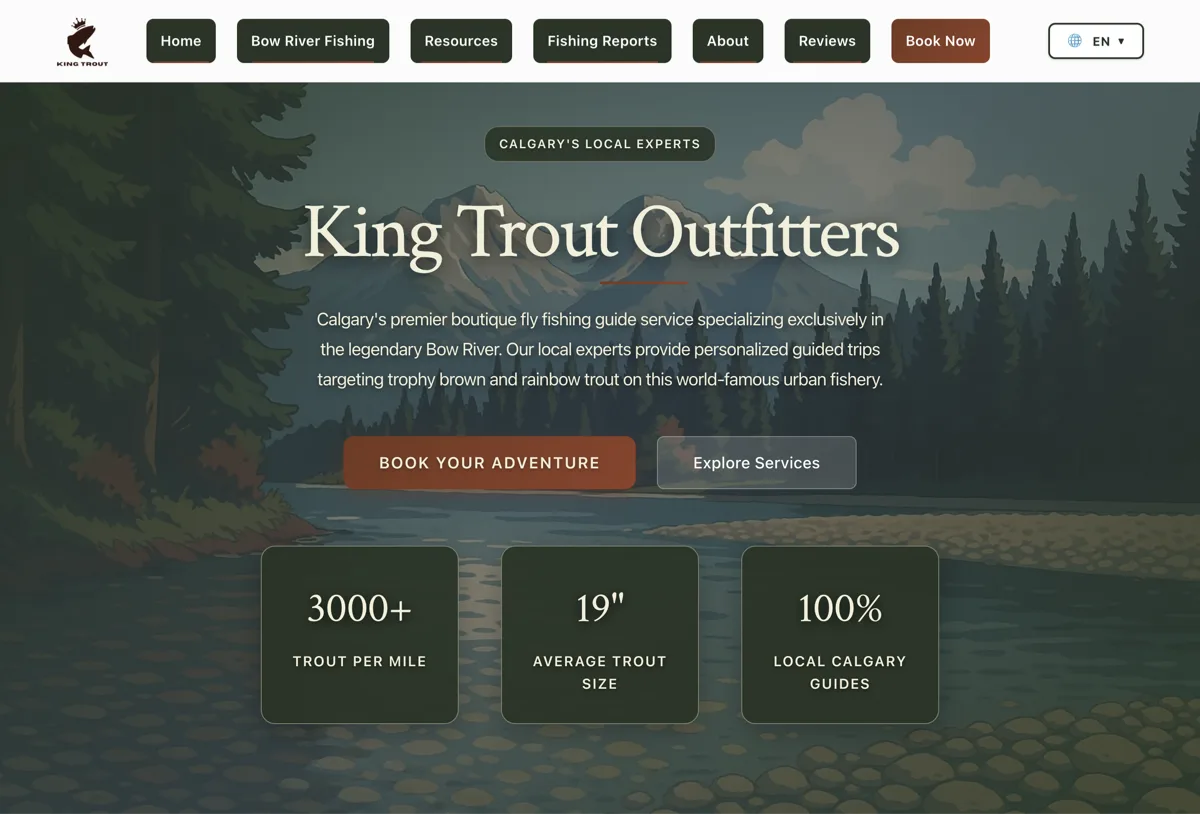
A custom-built site for a fishing guide where the whole experience funnels toward one outcome: book a trip. Rather than burying a contact form on a separate page, the hero puts the inquiry front and centre, backed by real photography that sells the experience. We built it on a fast static framework so it loads instantly even on a phone with patchy signal at the lake, exactly when a prospect is deciding.
What works
- Booking intent captured in the hero, not three clicks deep
- Real trip photography doing the persuasion
- Fast, mobile-first load for on-the-go decisions
What to copy
- Put your single most valuable action in the hero
- Use authentic photos of the actual experience, not stock
2. Okanagan Patio Covers
That's Us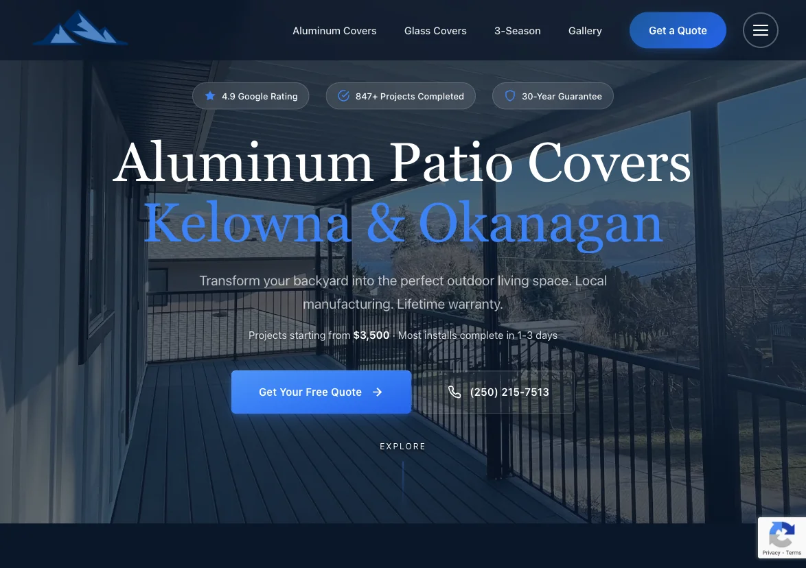
The clearest form-first example in our portfolio. The hero leads with a quote-request form, so a homeowner who already wants a patio cover can act in seconds without hunting for a contact page. The result is verifiable: in the year after launch, organic active users grew 660% year over year and new users rose 756%, with the fast, SEO-ready build pulling in the relevant traffic that the form then converts. This is the relevant-traffic-times-frictionless-action equation in one site.
What works
- Quote form in the hero: zero hunting for "contact"
- SEO foundation drove +660% active users YoY
- Fast load keeps mobile visitors from bouncing
What to copy
- Move your quote form into the hero on home services sites
- Pair conversion design with SEO so the form has traffic to convert
3. PaintQuote App
That's Us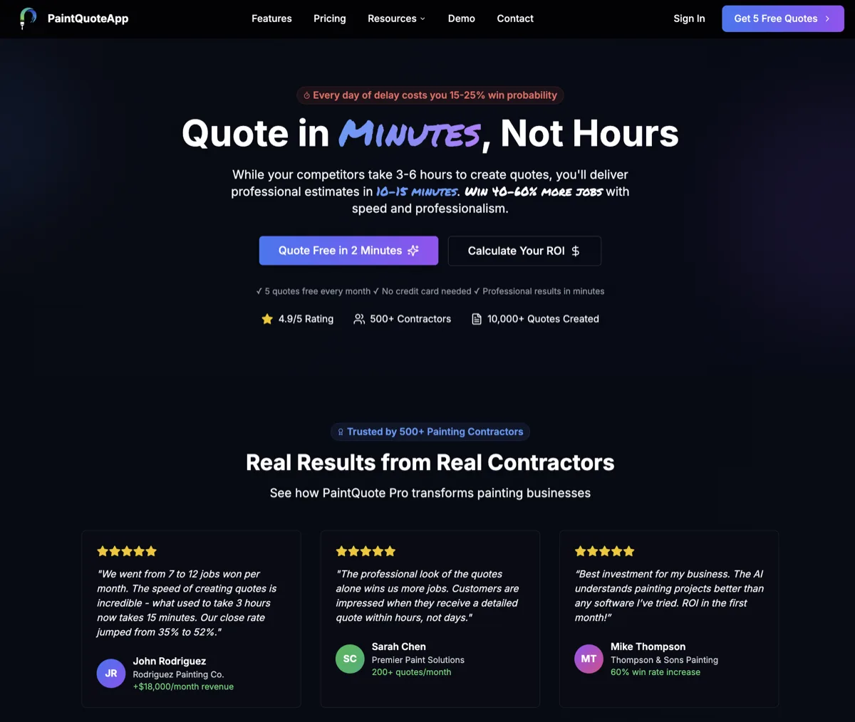
Here the interactive tool is the offer. Instead of asking visitors to fill a form and wait, PaintQuote lets them generate an instant estimate: they get real value first, which makes handing over contact details an easy yes. This is one of the most powerful lead gen patterns: replace "contact us and we'll get back to you" with "get your answer right now." The tool both qualifies and captures in a single step.
What works
- Visitor gets value (an estimate) before giving up info
- The tool qualifies the lead automatically
- "Get an answer now" beats "we'll call you back"
What to copy
- Turn your quote process into a self-serve tool
- Deliver the result instantly, capture contact info to send the full details
4. Koala Coats Painting
That's UsKoala Coats shows the other half of the equation: a lead gen website is only as good as the traffic reaching it. The build ranks for 65+ keywords and posts top-tier Lighthouse scores (100/100 SEO and performance), so high-intent local searchers land on a fast page and convert through a clean contact path. It is proof that conversion design and SEO are inseparable: rankings put qualified visitors in front of the offer.
What works
- Ranks for 65+ keywords, feeding the form qualified traffic
- Lighthouse 100/100 SEO and performance
- Clean, single-path contact flow
What to copy
- Invest in SEO so your conversion-ready page actually gets visitors
- Treat speed as a ranking and conversion feature, not an afterthought
5. SaaS Free-Trial Homepage
The classic SaaS homepage (think the pattern used by tools like Slack, Notion, or HubSpot) leads with a crisp value proposition and one dominant action: start a free trial, usually with email-only signup. There is no menu of competing asks: everything points at trial activation. We are describing the mechanics here, not quoting their internal numbers, because only those companies can verify those.
What works
- One headline benefit, one dominant CTA
- Email-only signup removes friction
- The product itself becomes the lead nurture
What to copy
- Strip your homepage down to one benefit and one CTA
- Let people start before you ask for everything
6. Local Service "Get a Quote" Site
The dependable local-service pattern: a prominent phone number in the header, a short "get a free quote" form repeated through the page, service-area trust signals, and reviews near the CTA. It converts because the visitor usually has urgent intent (a leak, a broken furnace) and the site removes every obstacle between that intent and contacting the business.
What works
- Phone number and form always within reach
- Trust signals (reviews, service area, guarantees) by the CTA
- Matches urgent, high-intent visitors
What to copy
- Repeat your quote CTA as the visitor scrolls
- Put your phone number in the header and make it tappable
7. Calculator Lead Magnet
A calculator (mortgage payment, ROI, savings, project cost) gives visitors something genuinely useful, then captures an email to deliver the detailed breakdown. It converts because the visitor is already in evaluation mode and the result is personally relevant to them. Our own PaintQuote build is a contractor version of this same mechanic.
What works
- Delivers personalized, useful output
- Captures high-intent, evaluation-stage visitors
- Naturally qualifies leads by their inputs
What to copy
- Find a number your customers want to know and build a calculator for it
- Show a teaser result, gate the full breakdown behind an email
8. Quiz / Assessment Funnel
A short multi-step quiz that ends in a personalized score or recommendation, for example, a "readiness" or "health" assessment. The step-by-step format keeps engagement high, and by the final question the visitor has invested enough to want their result, which they receive in exchange for contact details. We use this exact pattern in our own exit-marketing score quiz.
What works
- Step-by-step format keeps people moving forward
- Personalized result feels worth the email
- Answers segment and qualify the lead
What to copy
- Turn your diagnostic process into a short quiz
- Reveal the score only after capturing contact info
9. Gated Ebook Landing Page
A focused page offering a genuinely valuable guide, report, or template in exchange for an email. It converts when the asset solves a real problem the audience already searches for, and when the form is short. The trade has to feel fair: a thin two-page PDF behind a ten-field form does not.
What works
- A single, clearly valuable asset
- Short form, no distractions on the page
- Topic matches what the audience already searches
What to copy
- Make the asset worth more than the email it costs
- Strip the landing page down to the offer and the form
10. Webinar Registration Page
A registration page built around a specific date and time, a clear "what you'll learn" list, and a presenter who lends authority. The fixed date creates natural urgency, and even no-shows become nurtured leads. It works because the visitor commits to a calendar slot, not just a download.
What works
- A real date creates honest urgency
- Clear "what you'll learn" bullets sell the value
- Registrants enter a nurture sequence either way
What to copy
- Use a fixed date instead of "sign up anytime"
- List the specific takeaways above the form
11. Click-to-Call Contractor Site
For services where speed matters (locksmiths, emergency plumbers, towing), the highest-converting element is a sticky tap-to-call button that follows the visitor down the mobile page. Most of this traffic is on a phone with urgent intent, and a single thumb tap to call beats any form. The whole site exists to get that tap.
What works
- Sticky call button always one tap away
- Removes typing entirely for urgent visitors
- Mobile-first layout matches how people actually search
What to copy
- Add a sticky tap-to-call bar on mobile
- Make calling, not form-filling, the primary action for urgent services
12. Booking / Scheduling Page
Instead of "contact us and we'll find a time," an embedded scheduler lets the visitor pick a slot on the spot. Collapsing the back-and-forth into one step captures the lead at peak intent (the moment they decide) rather than risking they cool off while waiting for a reply.
What works
- Removes scheduling back-and-forth
- Captures the lead at the peak of intent
- A booked slot is a far stronger lead than a form fill
What to copy
- Embed a scheduler instead of a generic contact form
- Let people book the first call themselves
13. Free Audit / Teardown Offer
Offering a free, personalized audit (of a site, ad account, or process) converts because it is specific to the visitor and demonstrates expertise before any money changes hands. It is exactly the offer we lead with on our own service pages: a free review that starts the relationship with value. The trade-off is that audits take real time to deliver, so this suits higher-ticket services.
What works
- Personalized to the individual visitor
- Proves expertise before the sale
- Starts the relationship with a value exchange
What to copy
- Offer a free review of the prospect's own situation
- Reserve it for offers worth the delivery time
14. Comparison / "vs" Landing Page
A "Brand A vs Brand B" or "alternatives to X" page captures people at the very bottom of the funnel: they are no longer asking whether to buy, only which. A clear feature matrix plus a confident CTA converts this high-intent traffic well, which is why comparison pages are a staple of mature SaaS sites.
What works
- Targets ready-to-decide searchers
- Feature matrix answers the final objection
- Pairs naturally with a strong CTA
What to copy
- Build honest comparison pages for the queries buyers actually type
- Lead the page with a clear, fair feature table
15. Local Multi-Location Site
For businesses serving multiple cities, dedicated location pages (each with local content, reviews, and its own quote form) both rank for "[service] near me" searches and convert better, because the visitor sees their own town reflected back. It is the SEO foundation and the conversion path working together, scaled across a service area.
What works
- Each city page ranks for local "near me" searches
- Local relevance lifts trust and conversions
- Per-location forms route leads correctly
What to copy
- Build a real page per city, not one "areas we serve" list
- Put a location-specific form on each page
The Conversion Patterns Behind Them
Strip away the industries and these 15 examples reduce to a handful of repeatable patterns. Pick the one that matches your offer:
- Form-first hero: put the quote or inquiry form above the fold (Okanagan Patio Covers, local service sites). Best when intent is already high.
- Tool-as-offer: an instant quote, calculator, or quiz delivers value before asking for contact info (PaintQuote, calculator and quiz funnels). Best when you can productize your estimate or diagnosis.
- Single-CTA simplicity: one benefit, one button, nothing competing (SaaS free trial). Best for product-led signups.
- Click-to-call: a tap is the conversion (emergency and mobile-first trades). Best for urgent local services.
- Book the slot: an embedded scheduler captures the lead at peak intent (booking pages). Best for appointment-based businesses.
- Value-gated content: ebook, webinar, or audit traded for contact details (B2B demand gen). Best for longer sales cycles.
- SEO-fed conversion: rankings and location pages put qualified traffic in front of any of the above (Koala Coats, multi-location sites). This is the foundation under all of them.
Notice the through-line: every pattern is the same equation in a different costume: get the right person to the page, then make the next step effortless.
Common Mistakes That Kill Conversions
- A slow site. If the page takes several seconds to load, you lose leads before the offer ever appears. Speed is a conversion feature.
- Too many competing CTAs. Five buttons asking for five things gets you nothing. One dominant action per page.
- Long forms. Every extra field costs completions. Ask only for what you truly need to follow up.
- No phone number, or an untappable one. For local services this single miss can halve your inquiries.
- No social proof near the CTA. Reviews and real photos belong right where the visitor decides, not buried on an "about" page.
- A beautiful site nobody finds. Conversion design with no SEO is a storefront in the desert. You need both.
How to Build One for Your Business
Pick the pattern that matches your offer, then execute the fundamentals: a fast custom build, one clear offer per page, a short form or a tap-to-call button, proof beside the CTA, and an SEO foundation feeding it qualified traffic. That is exactly how we build at Zio Advertising: conversion-focused design and SEO baked in from day one.
We are a Kelowna, BC agency led by founder Sep Gaspari, and we build custom lead generation websites on fast static frameworks that hit Lighthouse 100/100 and sub-1-second loads. You own the site: no rented platform, no hostage data. The four client examples at the top of this article (King Trout, Okanagan Patio Covers, PaintQuote, Koala Coats) are all our work, with the real results to back them up. Browse the full portfolio to see more.
Frequently Asked Questions
What is a lead generation website?▼
A lead generation website is a site built with one primary job: turn visitors into contacts you can follow up with. Instead of just informing or selling directly, it captures a name, email, phone number, or booking through forms, quote tools, calculators, or click-to-call buttons. Every page guides the visitor toward a single clear action. A brochure site describes a business; a lead generation website is engineered to produce inquiries.
What makes a website convert visitors into leads?▼
The biggest factors are a fast load (every extra second of load time measurably drops conversions), one clear offer instead of competing messages, a short friction-free form, visible social proof, and a CTA that is obvious on every screen. On mobile, a tap-to-call button matters enormously for local services. Underneath all of it sits an SEO and technical foundation so the right people actually land on the page in the first place. Conversion is the product of relevant traffic times a frictionless path to action.
How much does a lead generation website cost?▼
A simple template site can be a few hundred dollars, but a custom, conversion-focused lead generation website typically runs from a few thousand dollars for a small local business up to five figures for a multi-location or SaaS build. The cost reflects strategy, copywriting, conversion design, fast custom development, and SEO setup, not just a theme. The right way to judge cost is against the value of one new customer: if a single closed lead is worth thousands, a site that produces a steady stream of them pays for itself quickly.
What is the difference between a lead gen website and a landing page?▼
A landing page is a single, standalone page focused on one campaign or offer, usually where you send paid traffic. A lead generation website is the full site (home, services, locations, articles) where every page is designed to capture leads from organic search, referrals, and direct visits. Landing pages are great for ads; a lead gen website builds a compounding stream of organic leads over time. Most businesses need both: the website as the foundation and landing pages for specific campaigns.
What are the best CTAs for a lead generation website?▼
The best CTAs are specific and value-led rather than generic. "Get my free quote," "See my instant estimate," "Book a 15-minute call," and "Get a free site audit" outperform vague buttons like "Submit" or "Learn more" because they tell the visitor exactly what they get and lower the perceived commitment. For mobile local services, a tap-to-call button is often the single highest-converting CTA on the site. Use one dominant CTA per page and repeat it as the visitor scrolls.
How many form fields should a lead generation form have?▼
Fewer is almost always better. Each extra field reduces completion rate, so ask only for what you genuinely need to follow up: often just name, email or phone, and a short note. You can qualify the lead in the follow-up conversation rather than the form. The exception is when you intentionally want fewer but higher-intent leads (for example, a high-ticket service), where a couple of qualifying questions filter out tire-kickers. Start short, then add a field only if your sales process truly requires it.
Do I need a chatbot or quiz on my lead generation website?▼
Not necessarily. A chatbot or quiz can lift conversions when it removes friction: answering a quick question, routing the visitor, or delivering a personalized result like a quote or score. But added for its own sake, it can distract from the main CTA or annoy visitors. Start with the fundamentals (fast load, clear offer, simple form, click-to-call) and add an interactive tool only when it makes the offer easier to say yes to, such as an instant-quote calculator for a contractor.
How do I measure a lead generation website’s conversion rate?▼
Divide the number of leads (form submissions, calls, bookings, chats) by the number of visitors over the same period, then multiply by 100. Use call tracking and form tracking so every inquiry is attributed to its source, and watch cost per lead alongside raw conversion rate. Rates vary widely by industry, but tracking your own trend month over month (and segmenting by traffic source) matters far more than chasing a benchmark number. Tie conversions to real revenue so you know which pages and channels actually produce customers.
Want a Lead Generation Website Like These?
We build custom, conversion-focused lead generation websites on fast static frameworks: Lighthouse 100/100, sub-1-second loads, SEO from day one, and you own it. If you want a site that captures inquiries instead of just looking good, we should talk.
Related Reading

Written by
Sep Gaspari
Founder & Digital Marketing Strategist, Zio Advertising | Kelowna, BC
15+ years in digital marketing, Google Ads, and SEO. I've helped businesses across 12+ industries generate qualified leads and grow revenue through data-driven strategies. I don't just run campaigns, I obsess over results, test relentlessly, and treat your budget like it's my own.
Connect on LinkedIn→Last updated: May 2026. Examples 1-4 are Zio Advertising client builds with verifiable results; examples 5-15 are well-known lead generation website patterns described qualitatively. We do not fabricate conversion rates for sites we do not own.